Sisitech Carousel Library
Sisitech Carousel is an angular library to easily create and control slideshows for different html components.
Installation
Usage
Import the library
| app.module.ts | |
|---|---|
About
The sisitech carousel library has the following properties :
| Input | Description |
|---|---|
| [sliderOptions] | Takes an array of items that each slide will have. It's necessary to prepare the different components for the data given by the sliderItems array. |
| [sliderItems] | Takes an array of slide items The array takes the following items :
|
| [slidesToShow] | Takes a number and determines the number of slides that will be in view. The default value is 3. |
| [autoSlide] | Takes a bolean value and makes the slides move automatically. The default value is false. |
| [controls] | Takes a bolean value and toggles between shwoing and hiding the previous and next buttons The default value is true. |
| [indicators] | Takes a bolean value and toggles between shwoing and hiding the indicator dots The default value is true. |
| [slideInterval] | Takes a number and determines the speed at which the slides move on autoSlide The default value is 4000 (4s). |
Note
The inputs [sliderItems] and [sliderOptions] are compulsory inputs.
Example
Single Component Carousel
The library can be used to create a slideshow for single components, e.g. images only, as shown below.
| app.component.html | |
|---|---|
Caution
The first id value for the sliderItems needs to be 0 not 1. Otherwise the first slide will not be shown. Working to improve this restriction in future releases.
Result

To create a more automated slideshow, one can remove both the controls and the indicators as well as activate autoslide with a set interval. The code snippet would thus look like this :
| app.component.html | |
|---|---|
Result

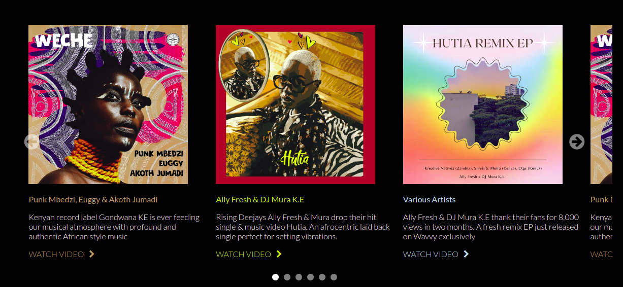
Multi-Component Carousel
The library can also be used to create a slideshow for more complex html elements, e.g. cards e.t.c, as shown below.
| app.component.html | |
|---|---|
Result
Note
Selecting an image using the indicator causes it to appear as the first image on the carousel.
Styling
It's advised to add an id attribute to each carousel to aid in targeting the styling to a specific carousel in the event that your page has more than one carousel.
| app.component.html | |
|---|---|
Note
All the custom styling for the carousel should be put in the global styles.scss file.
#wavvyOne {
    .slider-img{ //styles the header image for all the slides
        max-width: 90%;
        min-width: 45%;
    }
    .carousel-btn { // styles the next and previous buttons
        color: white;
    }
    .dot { // styles the indicator dots
        background-color: white;
    }
    .slider-meta { // styles the all the text in the slider
        color: white;
        font-weight: 300;
        font-family: 'Lato', sans-serif;
    }
    .slider-title { // styles the slider title
        font-weight: 400;
    }
    .slider-desc{ //styles the slider description
        font-weight: 300;
    }
    // the classes below are used to style each slide individually
    // these are the classes we passed in the sliderItems array above
    .hutia {
        img{
            width: 70%;
            margin-top: 10px;
            margin-left: 15px;
        }
        a, .slider-title {
            color: $hutia;
        }
    }
    .weche {
        a, .slider-title {
            color: $weche;
        }
    }
    .hutia-remix {
        a, .slider-title {
            color: $hutia-remix;
        }
    }
}
Responsivness
| Screen Size | Number of Slides in View |
|---|---|
| 320px - 400px | one |
| 401px to 600px | three |
| 601px and above | As determined by user The default is 4 |