Design Specification Format
About
This section outlines a brief description of the application. Can be a descriptive one liner highlighting the purpose of the project. It can also provide general information about the project beyond what it's for; details like the client of the project, how the project works e.t.c.
Product Structure
This section describes the general structure of the application i.e how information is displayed, the sections in the application and the navigation used in the app. It has the following sub sections :
Information Structure
A description of how information is displayed on the application. In a nutshell information structure could take any one of the following structures:
| Information Structure | Description | Examples |
|---|---|---|
| Catalog Structure | A catalog contains categorized, hierarchical data, with a top level consisting of peers which may each contain subordinate data. It is similar to a catalog that is basically a list of systematically organised items. Such a structure allows users to browse an area of interest, compare items to each other, and view the details of a specific item. | Material Design Basil ; Amazon |
| Dashboard Structure | A dashboard structure has two main columns with one side being the navigation panel and the main column being the section where UI is oragnised towards he specific tasks outlined on the navigation column | G-mail |
| Hierachical Structure | This structure orgainses UI in a manner that allows users to view content through a variety of catgeroies from the most general view to the most detailed view. | Wavvy Wallet |
| Hub and Spoke Structure | This structure stats with a main section that serves as a "hub" where various "spokes", or chld nodes, are available for users to choose from. Once the user chooses a "spoke", the UI switches to the "spoke" whicb now becomes a "hub" with more "spokes" or child nodes | Udemy |
| Flow Structure | A flow structure is a task-based structure, requiring screens to be accessed in consecutive order. | Airbnb |
Navigation
A brief of the structure of navigation panels used in the application on different screens. The section highlights the main sections of the application, what each section is about and also describes the tabs used to get from one section of the app to another.
Aesthetic
A description of the look and feel of the application's user interface. The table below shows examples of different UI aesthetics an application can have:
| Aesthetic | Description | Examples |
|---|---|---|
| Functional Aesthetic | UI has a simple approach to content making use of basic deign conecpets to display information. Functional aesthetic emphasises the functionality of the application, placing ease-of-use over design elements that don’t have a functional purpose. | Material Design - Reply |
| Funky Aesthetic | UI uses bold typography and color choices to communicate. This aesthetic is characterised by use of highly contrasting color themes, typefaces and shapes. | Material Design - Owl |
| Premium Aesthetic | A premium aesthetic is used makes use of dark backgound colors and bright accent colors to represent cotent so that it stands out against the background. | Material Design - Rally |
| Data Driven Aesthetic | UI is focused on inforgraphics elements such as charts and graphs inviting the user to view the app's data. This aesthetic is dense and direct with an emphais on color, shape and typography. | Onekana |
| Minimal Aesthetic | UI uses subtle design components that provide a straight forward and effortless display of content which gives the user an experience where content and actions take the forefront of the user experience. | Material Design - Shrine |
| Content Focused Aesthetic | This asthetic tends to have the UI mimic content display as it's done in real life. It's less about abstarct design and more about relaying the conte t exactly as it's relayed in real life. | Material Design - Fortnighty |
Layout
Describes how the application looks like on different screens i.e on mobile, tablet and desktop.Can also highlight the use of grids in to structure the application's UI.
Colour
Outlines the colour pallate of the application and the reasoning behind choosing these colours. This includes default colors for:
- Primary and secondary colors
- Variants of primary and secondary colors
- Additional UI colors, such as colors for backgrounds, surfaces, errors, typography, and iconography.
- Alternative colors
An example
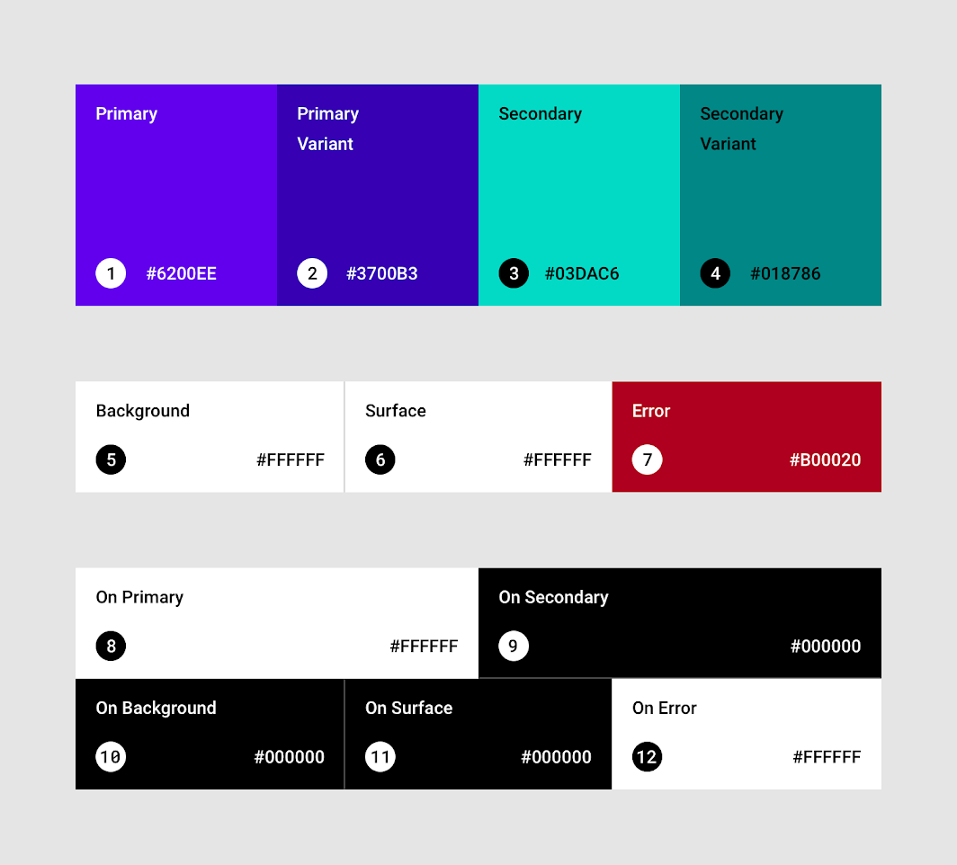
A breakdown of the colors
- Primary color : A primary color is the color displayed most frequently across an app’s screens and components.
- Dark and light primary variants : The primary color can be used to make a color theme for an app by including dark and light primary color variants. These variants are used to create contrast between UI elements, such as a top app bar from a system bar.
-
Secondary color : A secondary color provides more ways to accent and distinguish your product. Having a secondary color is optional, and should be applied sparingly to accent select parts of the UI. If there's no secondary color, the primary color can also be used to accent elements. Secondary colors are best for:
-
Floating action buttons
- Selection controls, like sliders and switches
- Highlighting selected text
- Progress bars
-
Links and headlines
-
Dark and light secondary variants : Just like the primary color, the secondary color can have dark and light variants. A color theme can use the primary color, secondary color, and dark and light variants of each color.
- Surface colors : Affect surfaces of components, such as cards, sheets, and menus.
- Background color : Appears behind scrollable content.
- Error color : Indicates errors in components, such as invalid text in a text field.
Note
Surface, background, and error colors typically don’t represent brand.
- On colors : Referr to the fact that they color elements that appear “on” top of surfaces that use the following colors: a primary color, secondary color, surface color, background color, or error color. “On” colors are primarily applied to text, iconography, and strokes. Sometimes, they are applied to surfaces.
-
Alternative colors : These are colors used as alternatives to the brand’s primary and secondary colors (they constitute additional colors to the theme). Alternative colors should be used cautiously, because they can be challenging to implement cohesively with existing color themes. They are best for:
-
Apps with light and dark themes
- Apps with different themes in different sections
- Apps that are part of a suite of products
Color Resources
Typography
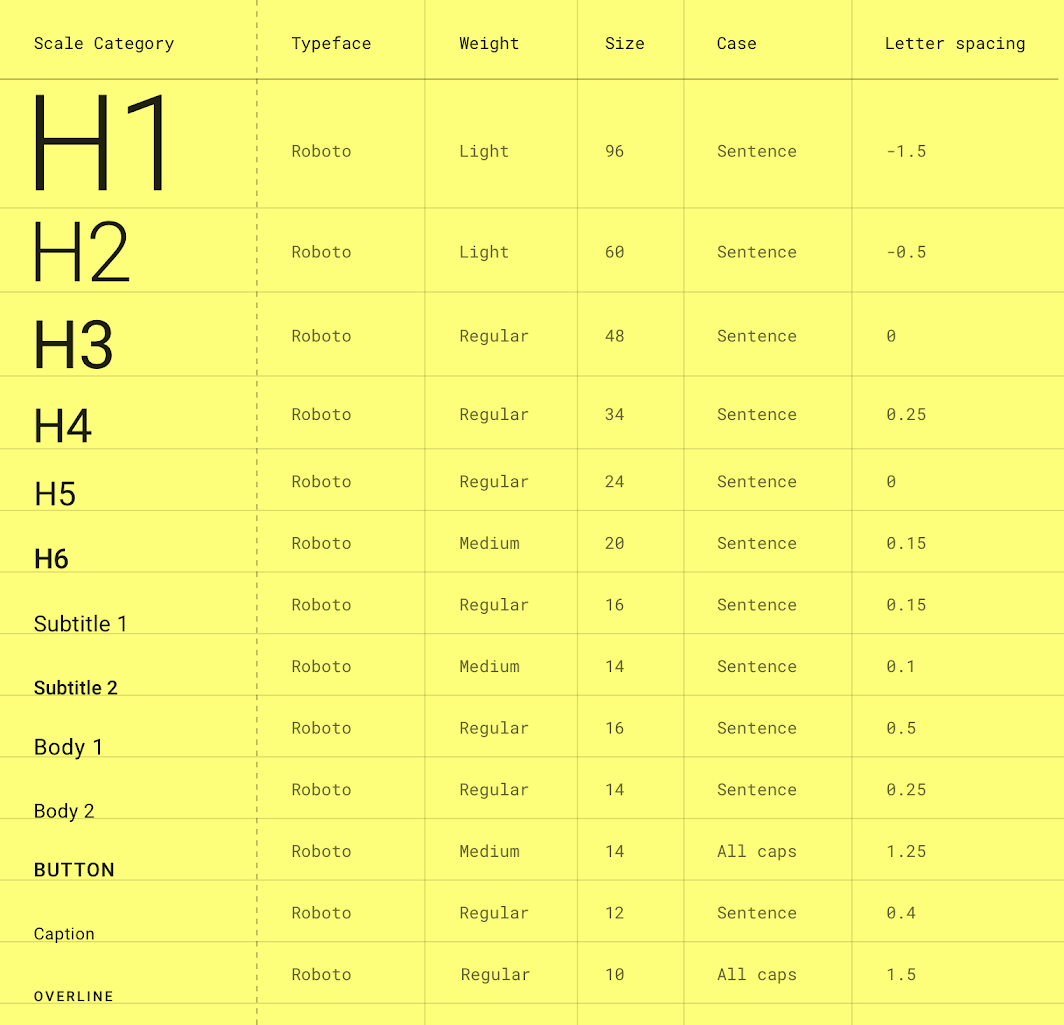
This section outlines the font families used in the application and the variations of these typefaces for different components in the application. The example below shows the various typescales used in an application's UI:
Typography Resources
Iconography
Brief of the icons used in the application and the justification behind the choice. Can also link to the zipped folder with the application's icon pack.
Iconography Resources
Components
Describes the key components of the application. E.g lists, forms, tabs, bottom sheets, tables, cards, buttons etc. Outlines their consistent look across the application.