Setting up Theming with Flutter's Flex Scheme Library
Background
FlexColorScheme is a library used to make beautiful Flutter Material Design themes. Apply optional surface blends, and use Material-3 style seeded color schemes. The returned themes are standard ThemeData objects, but very sophisticated ones. They are based on the same idea as Flutter's ThemeData.from(ColorScheme) and ThemeData(colorSchemeSeed) themes, but with many additional features. Choose from numerous pre-made designs or make your own. You can also use optional component sub theming, that are quick and easy to configure.
Step 1: Add flex_color_scheme to dependencies
Step 2: Copy ThemeData setup Code
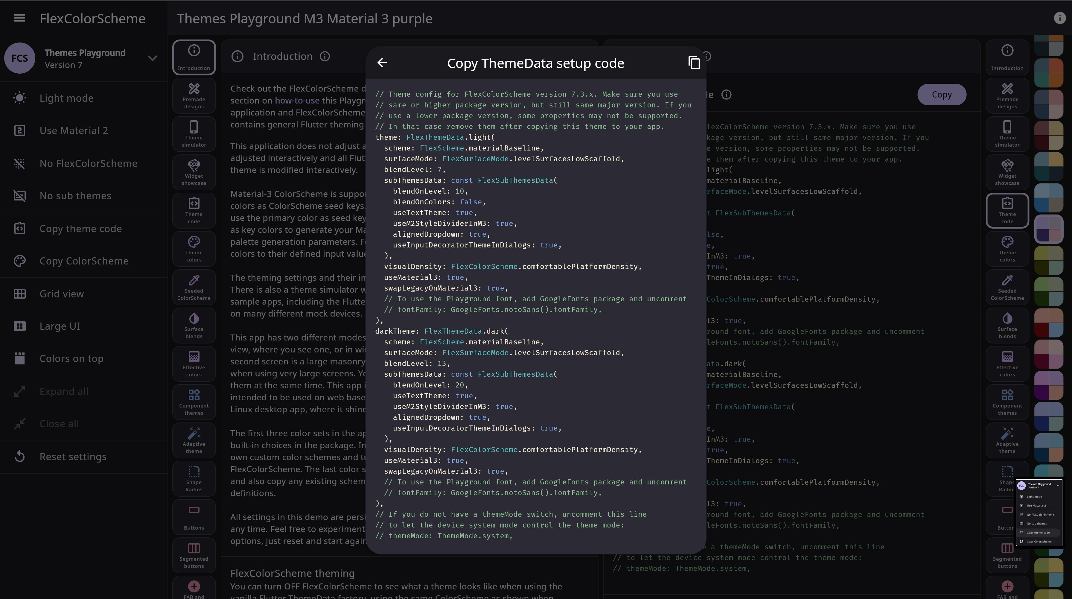
In order to fully utilize the features of the FlexScheme library, access the ThemesPlayGround where you can pre-select from the menu on the far left a color scheme of out 52 pre-built schemes. Once satsified with a theme, copy it's theme code.
Step 3: Add the setup code to your main.dart
  @override
  Widget build(BuildContext context) {
    return MaterialApp(
      title: 'Flutter Demo',
      // Theme config for FlexColorScheme version 7.3.x. Make sure you use
// same or higher package version, but still same major version. If you
// use a lower package version, some properties may not be supported.
// In that case remove them after copying this theme to your app.
      // Theme config for FlexColorScheme version 7.3.x. Make sure you use
// same or higher package version, but still same major version. If you
// use a lower package version, some properties may not be supported.
// In that case remove them after copying this theme to your app.
      theme: FlexThemeData.light(
        scheme: FlexScheme.verdunHemlock,
        surfaceMode: FlexSurfaceMode.levelSurfacesLowScaffold,
        blendLevel: 7,
        appBarElevation: 15,
        extensions: [],

        subThemesData: const FlexSubThemesData(
          blendOnLevel: 10,
          blendOnColors: false,
          useTextTheme: true,
          useM2StyleDividerInM3: true,
          alignedDropdown: true,
          useInputDecoratorThemeInDialogs: true,
        ),
        visualDensity: FlexColorScheme.comfortablePlatformDensity,
        useMaterial3: true,
        swapLegacyOnMaterial3: true,
        // To use the Playground font, add GoogleFonts package and uncomment
        // fontFamily: GoogleFonts.notoSans().fontFamily,
      ),
      darkTheme: FlexThemeData.dark(
        scheme: FlexScheme.verdunHemlock,
        surfaceMode: FlexSurfaceMode.levelSurfacesLowScaffold,
        blendLevel: 13,
        appBarElevation: 15,
        subThemesData: const FlexSubThemesData(
          blendOnLevel: 20,
          useTextTheme: true,
          useM2StyleDividerInM3: true,
          alignedDropdown: true,
          useInputDecoratorThemeInDialogs: true,
        ),
        visualDensity: FlexColorScheme.comfortablePlatformDensity,
        useMaterial3: true,
        swapLegacyOnMaterial3: true,
        // To use the Playground font, add GoogleFonts package and uncomment
        // fontFamily: GoogleFonts.notoSans().fontFamily,
      ),
// If you do not have a themeMode switch, uncomment this line
// to let the device system mode control the theme mode:
// themeMode: ThemeMode.system,

// If you do not have a themeMode switch, uncomment this line
// to let the device system mode control the theme mode:
// themeMode: ThemeMode.system,

      themeMode: ThemeMode.system,
      home: const MyHomePage(title: 'Flutter Demo Home Page'),
    );
}
Step 4: Adding Google Fonts
In order to customize your fonts while using the FlexColorScheme library:
- Import Google Fonts into your dependencies
      theme: FlexThemeData.light(
        scheme: FlexScheme.verdunHemlock,
        surfaceMode: FlexSurfaceMode.levelSurfacesLowScaffold,
        blendLevel: 7,
        appBarElevation: 15,
        extensions: [],
        subThemesData: const FlexSubThemesData(
          blendOnLevel: 10,
          blendOnColors: false,
          useTextTheme: true,
          useM2StyleDividerInM3: true,
          alignedDropdown: true,
          useInputDecoratorThemeInDialogs: true,
        ),
        visualDensity: FlexColorScheme.comfortablePlatformDensity,
        useMaterial3: true,
        swapLegacyOnMaterial3: true,
        // Font added below
        fontFamily: GoogleFonts.montserrat().fontFamily,
      ),
- Android Add permissions to your AndroidManifest.xml file
- MacOS Add permissions to the Release.entitlements and DebugProfile.enitlements files
Step 4.1: Bundling Fonts When Releasing
The google_fonts package will automatically use matching font files in your pubspec.yaml's assets (rather than fetching them at runtime via HTTP). Once you've settled on the fonts you want to use:
- Download the font files from https://fonts.google.com. You only need to download the weights and styles you are using for any given family.
- Move those fonts to some asset folder (e.g. google_fonts). You can name this folder whatever you like and use subdirectories.
- Ensure that you have listed the asset folder (e.g. google_fonts/) in your pubspec.yaml, under assets.
- Note: Since these files are listed as assets, there is no need to list them in the fonts section of the pubspec.yaml. This can be done because the files are consistently named from the Google Fonts API (so be sure not to rename them!)
Step 5: You're Done
You can now start using the flex_color_scheme library for more consistent look and feel across your applications utilizing the power of Material3. For more information on custom theming on components, typography and custom ColorScheme instructions, visit the FlexColorScheme website.